
What did I find?
There’s a place in Florida, near the city of Orlando, called Walt Disney World. It’s a hidden gem, if you will — a quaint, little-known vacation spot that few have heard of and fewer ever visit. But despite its near anonymity, the resort does a bustling trade in the cottage industry of theme park entertainment. It boasts four main parks containing scores of rides and other amusements. There’s even a website that gives copious information about all of them!
What’s in the box?
The Disney World website lets a user search and sort through the various park offerings. The Attractions & Entertainment page provides a listing and details for nearly everything to do at any park you care to filter for. I’ve been learning to use Tableau Public and was looking for a fun dataset to mess around with. Serendipity!
Caveat Emptor
I transcribed the information from the Disney World website to an Excel document myself. I haven’t gotten anyone to look through it and make certain it’s accurate — indeed, I imagine that anyone in my life whom I asked for such a favor wouldn’t be in my life much longer. Compounding this accuracy issue is the fact that there seem to be some irregularities with the keywords for the amusements on the page that I linked above. For example, some indoor attractions are listed as “Indoor” and some are not, and when the search filter is used to find “Indoor” rides, not all of the attractions that have that keyword appear in the list.
Also, there are a couple of attractions that are listed as being for “Kids, Teens, Adults,” leaving out the “Tweens” age group that appears for many other rides. Likewise, the Music of Mexico is apparently intended only for guests 13 and up.
Though I assume that such oddities are unintentional and that the Taiko drummers don’t have to stop playing whenever a guest between the ages of 10 and 12 wanders over, I also didn’t want to make too many assumptions about the data presented on the website. I made a bare handful of additions that seemed reasonable to me. Notably, I added my own tag for the movie or other property on which a ride was based so I could mark, for example, the Snow White rides with that tag and create a filter.
Also, I wouldn’t really call this data analysis. I just wanted a fun way to practice turning raw (or just lightly seared) data into a cool Tableau dashboard.
So…
I made an interactive dashboard to view, filter, and sort through the various amusements at the four main Disney World parks. Please note that users will get the best results on a desktop, and the dashboard may be unwieldy on a phone. Follow the image link below if you want to poke around!
How to Use It
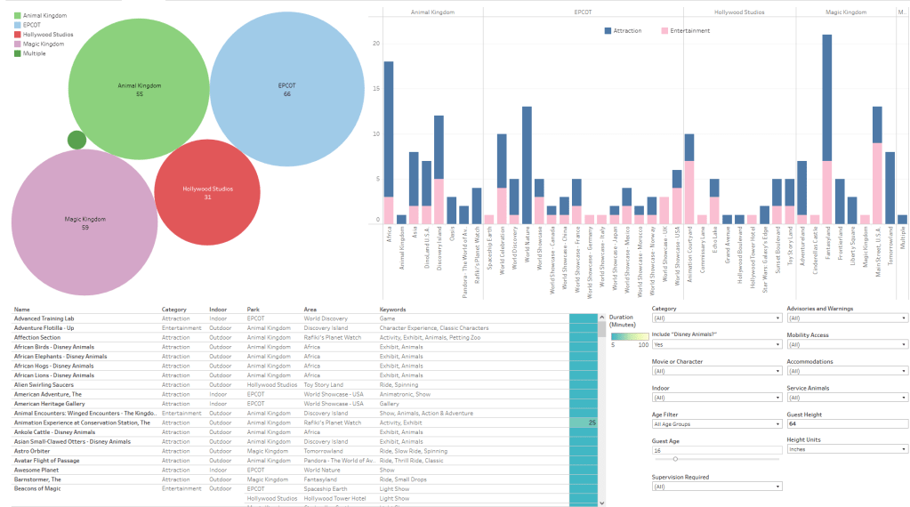
The top left corner of the visualization shows the four parks (and one activity that spans the whole resort). The labels show how many amusements at each park fit the current filters, and the bubbles’ size reflects the totals relative to each other. Clicking on a park bubble filters amusements for that park and zooms in on the data, and you can shift+click on multiple parks at once.
The top right shows the number of amusements broken down by park, area, and category (Attraction or Entertainment, as listed on the Disney World website). You can click on a park name (at the top), an area name (at the bottom), or a category bar (pink or blue), to zoom in and filter the amusements.
The bottom right contains a host of variables that you can choose from or ignore at your leisure.
The bottom left is the list of amusements with several columns of details. The list changes in response to your selected filters and parameters.
Have fun!
Sources
Disney World Attractions & Entertainment, Disney. https://disneyworld.disney.go.com/attractions/. Accessed 3/14/2023.
